
What Is Conversion-Focused Web Design? (And How to Do It) 98% of website visitors leave without taking action—conversion-focused web design is the key to turning traffic into revenue. Your business’s website can rank well and look great, but if it’s not converting it’s not serving its primary purpose. While an aesthetically pleasing website can impress, designing for conversions ensures that visitors actually contact you, sign up, or make a purchase.
Conversion-focused web design is strategic blend of user psychology, data analysis, and design principles that guide users toward a specific goal. Whether you're looking to increase leads, boost ecommerce sales, or improve sign-ups, this guide will break down what conversion-focused design is, why your business needs it, and how to implement it effectively.
Article Summary
By the end of this article, you’ll have actionable insights to optimize your website for higher conversions, lower bounce rates, and better business growth.
This guide covers:
- What conversion-focused web design is and why it’s essential.
- 11 core principles that drive higher engagement and conversions.
- Cognitive biases that influence website conversions.
- The link between SEO and conversion-optimized design.
- Practical strategies to implement conversion-driven changes on your site.
Table of contents
What Is Conversion-Focused Web Design?
Conversion-focused web design is a strategic approach to website development that prioritizes actions as well as aesthetics. While web design should emphasize branding and visual appeal, conversion-focused design is built to drive user engagement and encourage specific outcomes—like signing up for a service, completing a purchase, or requesting a quote.
How It Differs from Other Web Design Approaches
- Aesthetic-First Design: Prioritizes branding, visuals, and content presentation, often emphasizing creativity and storytelling over direct user actions. While your design team understandably wants to show off, those aren't the only things to consider for a website meant to drive leads.
- Conversion-Focused Design: Centers on usability, psychology, and data-driven strategies to maximize conversions. Design elements such as calls to action (CTAs), layouts, colors, and messaging, works together to guide users toward a specific goal.
Core Elements of Conversion-Focused Web Design
- Goal-Oriented Layout: Every page has a clear objective, minimizing distractions.
- User-Centric Navigation: Visitors should find what they need within three clicks or less.
- Compelling CTAs: Call-to-action buttons are highly visible, action-driven, and strategically placed.
- Trust Signals: Testimonials, case studies, and security badges reinforce credibility.
- Mobile Optimization: Over 60% of web traffic is mobile—responsive design is essential.
- Fast Load Times: Speed matters. A 1-second delay can lead to:
- 7% fewer conversions
- 11% fewer page views
- A 16% decrease in customer satisfaction
- Data-Driven Testing: A/B tests, heatmaps, and analytics inform design improvements.
Why Businesses Need Conversion-Focused Design
A conversion-focused website turns visitors and clicks into customers. Here’s why it matters:
- Higher ROI on traffic – Get more sales/leads from existing visitors.
- Lower cost per acquisition (CPA) – A well-optimized site converts more efficiently, making marketing efforts more cost-effective.
- Better user experience – A smoother, more intuitive website keeps users engaged.
- SEO benefits – Google rewards user-friendly, fast-loading sites with higher rankings.
The 11 Core Principles of Conversion-Focused Web Design
Conversion-focused design follows 11 key principles that ensure visitors stay engaged and take action. Each principle is rooted in user behavior, psychology, and data-driven strategies to improve conversions.
1. Goal-Oriented Design
Every page should have ONE primary goal. Whether it's signing up, making a purchase, or requesting a demo, the page should eliminate distractions that don’t support this goal.
Too many options overwhelm users. Studies show that reducing choices can increase conversions by up to 20% (Hick’s Law).
Example: Duolingo’s lesson screens are designed for one goal: completing the task. There are no unnecessary menus or links that could lead users away from finishing their lesson, and the next-step CTA ("Continue") is always clear.

Screenshot from Duolingo.com. It is used here for reference purposes only. No affiliation or endorsement is implied. If you are the owner of this content and would like it removed, please contact us.
2. User-Centric Navigation
Visitors should find what they need in 3 clicks or less. Confusing navigation causes frustration and higher bounce rates.
Clear, structured menus improve engagement. Users should intuitively know where to click next.
Example: Shopify simplifies its sign up system by gradually revealing more details based on user interest, avoiding clutter.

Screenshot from Shopify.com. It is used here for reference purposes only. No affiliation or endorsement is implied. If you are the owner of this content and would like it removed, please contact us.
3. Clarity in Messaging
Your website should instantly communicate:
- What you offer
- Why it matters
- What action users should take next
Confusing or vague messaging kills conversions. Users leave if they don’t understand your value within 5 seconds.
Example: Stripe’s homepage states simply: “Financial infrastructure to grow your revenue.”—clear, direct, and benefit-driven.
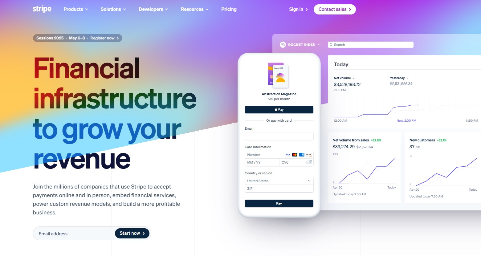
Screenshot from Stripe.com. It is used here for reference purposes only. No affiliation or endorsement is implied. If you are the owner of this content and would like it removed, please contact us.
4. Visual Hierarchy
Users scan pages in predictable patterns (F-pattern, Z-pattern). Place key CTAs and content along these paths.
Larger fonts, bold colors, and contrast guide attention. Eye-tracking studies show users focus on bold elements first.
Example: Apple’s product pages use bold headlines, large images, and CTA buttons to direct users toward purchases.
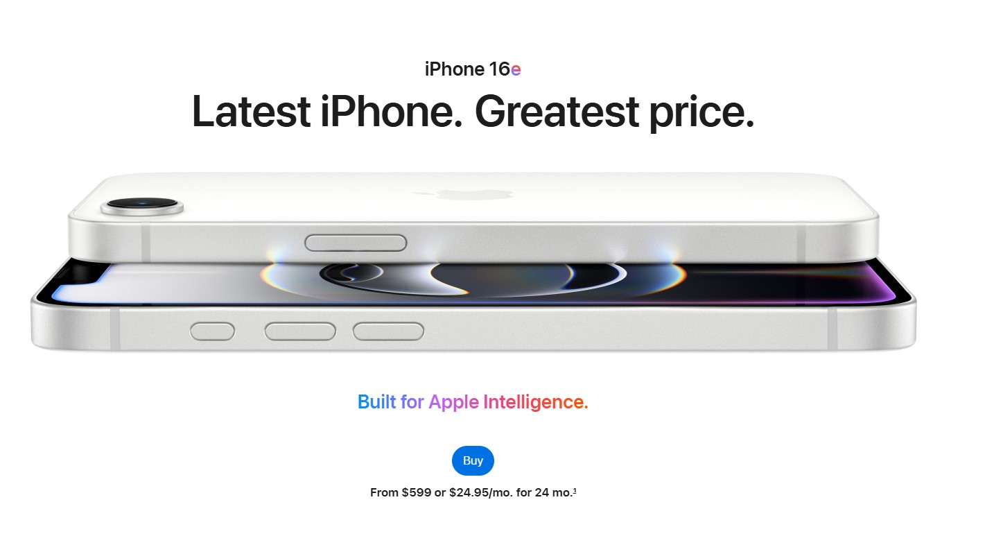
Screenshot from Apple.com. It is used here for reference purposes only. No affiliation or endorsement is implied. If you are the owner of this content and would like it removed, please contact us.
5. Strong, Action-Oriented CTAs
A weak CTA = lost conversions. Your call-to-action should be clear, visible, and compelling.
Best practices for high-converting CTAs:
- Use action-driven text: “Start Your Free Trial” (vs. “Submit”)
- Contrast colors to stand out from the page background
- Create urgency: “Limited-Time Offer – Claim Your Spot Now”
Example: HubSpot changed its CTA button color from green to red and saw a 21% increase in conversions.
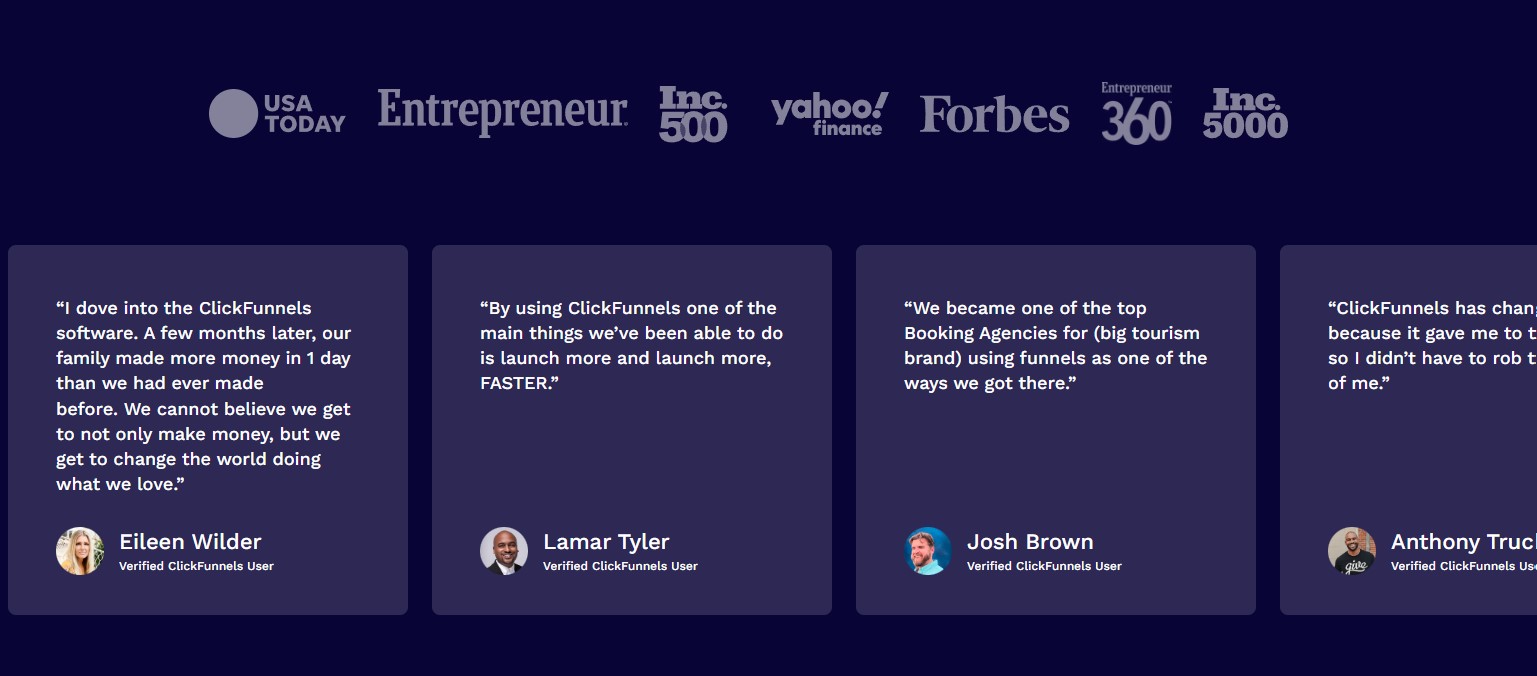
6. Trust Signals & Social Proof
People buy from brands they trust. 92% of consumers trust peer recommendations over ads.
How to build trust on your site:
- Customer reviews & testimonials (Real user feedback)
- Security badges & SSL certificates (Boosts credibility for payments)
- Social proof stats: “Trusted by 50,000+ customers”
Example: ClickFunnels features real customer video testimonials on their homepage and logos of partners, increasing conversions.
Screenshot from ClickFunnels.com. It is used here for reference purposes only. No affiliation or endorsement is implied. If you are the owner of this content and would like it removed, please contact us.
7. Mobile-First & Speed-Optimized Design
Over 60% of web traffic is mobile. If your site isn’t mobile-friendly, you’re losing leads and ranking power.
Google’s Core Web Vitals impact rankings. As mentioned, 1-second delay in page load can reduce conversions by 7%.
Example: Uber’s mobile-first design ensures fast ride bookings with minimal input, large touch-friendly buttons, and real-time location tracking.

Screenshot from Uber.com. It is used here for reference purposes only. No affiliation or endorsement is implied. If you are the owner of this content and would like it removed, please contact us.
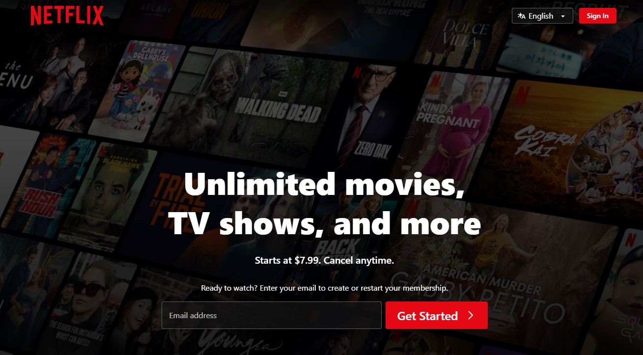
8. The Psychology of Color & Emotion
Color impacts decision-making.
- Red = Urgency & excitement (used in e-commerce sales)
- Blue = Trust & stability (common in finance & healthcare)
- Green = Growth & eco-friendliness (eco brands, wellness)
Using color contrast increases CTA visibility.
Example: Netflix uses high-contrast red CTAs on a dark background to grab attention and drive signups.
Screenshot from Netflix.com. It is used here for reference purposes only. No affiliation or endorsement is implied. If you are the owner of this content and would like it removed, please contact us.
9. Data-Driven Decision-Making (A/B Testing)
Test everything. Assumptions don’t drive conversions—using data does.
What to A/B test:
- Headlines & CTA buttons
- Page layouts & forms
- Images & trust signals
Example: A case study found that changing a CTA from "start your 30-day free tral period" to "start my 30-day free trial period" increased conversions by 90%.
10. Reducing Friction in the Conversion Process
Complex processes = lost conversions.
Optimizations to simplify user actions:
- Reduce form fields (only ask for necessary info)
- Implement 1-click checkout for faster transactions
- Make pricing transparent (hidden fees kill trust)
Example: Amazon’s 1-click purchase button drastically reduces cart abandonment.
11. The Rule of One
Each page should focus on ONE primary action. More than one competing CTA confuses users.
Example: Spotify’s premium landing page focuses entirely on converting free users to paid subscribers, with only “Get started” or "View all plans" CTAs and no competing actions.
Best Practice: If multiple CTAs are needed, use a primary and secondary CTA with different emphasis.
By implementing these 11 principles, businesses can make their website an active driver of revenue instead of something that just provides information and makes you look good.

Screenshot from Spotify.com. It is used here for reference purposes only. No affiliation or endorsement is implied. If you are the owner of this content and would like it removed, please contact us.
10 Cognitive Biases That Influence Website Conversions
Cognitive biases play a major role in decision-making—including whether users convert on your website.
By understanding and leveraging these psychological principles, you can optimize your site to encourage more conversions.
1. Zeigarnik Effect (The Unfinished Task Bias)
Users feel compelled to complete unfinished tasks.
- Use progress bars to show checkout or sign-up completion.
- Step-based forms encourage users to finish the process.
- Show "X% complete" indicators for onboarding.
2. Loss Aversion (Fear of Missing Out - FOMO)
People fear losing something more than they value gaining it.
- Use urgency tactics: “Only 2 left in stock!”
- Scarcity triggers: “Sale ends in 3 hours!”
- Exclusive deals: “Limited-time VIP offer.”
People trust experts, celebrities, and authoritative sources more.
- Showcase endorsements from industry leaders.
- Use trust signals like certifications and awards.
- Leverage influencer marketing for credibility.
4. Social Proof (Bandwagon Effect)
People follow the crowd and trust what others are doing.
- Display testimonials and case studies prominently.
- Show customer counts: “Join 50,000+ satisfied users.”
- Live activity notifications: “John just purchased this product!”
People rely too heavily on the first piece of information they see.
- Compare pricing plans (e.g., show the highest-priced package first).
- Strike-through pricing: “$299
$199(Save 30%)” - Highlight premium options before the standard choice.
6. Hick’s Law (Choice Overload Bias)
The more options people have, the harder it is to decide.
- Limit choices in pricing plans (3 is ideal).
- Use clear CTAs that guide users to one action.
- Avoid clutter—simplify product pages.
When you give something for free, people feel obligated to return the favor.
- Offer free resources (guides, trials, consultations).
- Provide upfront value before asking for a sale.
- Gift discounts after sign-ups.
People place more value on things they already “own.”
- Free trials with “Keep Your Data” strategies.
- Virtual try-ons or customization tools.
- Saved carts and wish lists to increase attachment.
People change their preference when given a “decoy” option.
- Offer three pricing tiers, with the middle one being the most attractive.
- Use strategic pricing to steer users toward the preferred choice.
People remember the most intense part (peak) and the last part (end) of an experience.
- Create an amazing final step in the conversion process (e.g., a fun “Thank You” page).
- Make high-impact moments stand out (surprise bonuses, rewards).
- Leave users with a positive impression to encourage referrals.
By integrating these cognitive biases into your conversion-focused web design, you can make your website more persuasive, intuitive, and profitable.
Want help optimizing your pages with these principles? Let’s talk!
The Link Between SEO & Conversion-Focused Web Design
A well-designed, conversion-focused website doesn’t just boost sales and leads—it also plays a critical role in search engine optimization (SEO).
Google and other search engines prioritize user experience (UX), engagement metrics, and page performance, all of which are core elements of conversion-focused design.
Here’s how SEO and conversion-focused web design work together
Google Rewards User-Friendly, Fast Websites
Page speed is a ranking factor—a site that loads in under 3 seconds ranks better and converts more visitors.
Google’s Core Web Vitals (Largest Contentful Paint, First Input Delay, Cumulative Layout Shift) directly impact rankings.
Solution: Optimize images, minify code, use a content delivery network (CDN), and reduce server response time.
Lower Bounce Rates & Higher Engagement Improve SEO
If visitors leave your site quickly, Google sees it as a sign of low relevance or poor experience.
Conversion-focused design reduces bounce rates by improving navigation, content clarity, and CTA placement.
Solution: Use clear messaging, compelling CTAs, and engaging visuals to keep visitors exploring your site.
Clear Structure & Navigation Enhance Indexing
Well-structured sites help Google crawl and index pages efficiently.
A logical site hierarchy, clean URLs, and internal linking improve both SEO and user experience.
Solution: Use structured data (schema markup) and ensure all pages are linked properly.
Mobile Optimization Boosts Rankings & Conversions
Over 60% of web traffic is mobile, and Google’s mobile-first indexing means your mobile site affects your rankings more than desktop.
Conversion-optimized mobile designs improve both search visibility and engagement.
Solution: Use responsive design, prioritize fast-loading elements, and simplify navigation for mobile users.
Content Optimization Increases Search Visibility & Conversions
SEO content should attract visitors, while conversion-focused design should turn them into customers.
Well-structured blog posts, landing pages, and FAQs help rank for relevant keywords.
Solution: Integrate relevant long-tail keywords, optimize meta descriptions, and include compelling CTAs.
UX Signals & AI Search Prioritization
Google’s RankBrain algorithm prioritizes sites with high engagement, easy navigation, and relevant content.
AI-generated search overviews favor structured, well-optimized content.
Solution: Make content easy to scan with bullet points, headers, and clear value propositions.
Why Aligning SEO & Conversion Matters
By combining SEO and conversion-focused web design, businesses achieve:
- More organic traffic from search engines.
- Higher engagement with user-friendly experiences.
- Better conversion rates—turning visitors into leads and customers.
If your website isn’t optimized for both SEO and conversions, you’re losing traffic and revenue.
What Are the 7 Levels of Conversion?
The 7 levels of conversion outline the progressive psychological and behavioral steps a user takes before completing a desired action, such as making a purchase or signing up. Understanding and optimizing each step helps increase overall conversions.
1. Awareness – The user lands on the page.
This is the first touchpoint where a user becomes aware of your brand, often through SEO, social media, or ads.
Key Optimization Tactics:
- SEO-friendly content & meta descriptions to drive organic traffic.
- Compelling, keyword-driven headlines that capture attention.
2. Interest – They scan for value (headlines, visuals, social proof).
Users quickly assess whether the site is relevant to their needs.
Key Optimization Tactics:
- Clear messaging that answers: “What’s in it for me?”
- Strong hero images, testimonials, and social proof to build credibility fast.
3. Engagement – They explore further (product pages, blog posts).
At this stage, users start interacting with your content, diving into blog posts, product pages, or services.
Key Optimization Tactics:
- Internal linking to guide users through relevant pages.
- Interactive elements like quizzes or videos to hold attention.
4. Consideration – They compare options (pricing, testimonials).
Users evaluate competitors, pricing, and features before making a decision.
Key Optimization Tactics:
- Comparison charts & pricing transparency to build trust.
- Case studies, reviews, and guarantees to remove hesitation.
5. Intent – They engage with a CTA (add to cart, sign up).
Now, the user shows strong purchase intent—they’re one step away from converting.
Key Optimization Tactics:
- High-contrast, compelling CTAs with action-driven language.
- Limited-time offers & urgency tactics to nudge action.
6. Action – They complete the conversion (purchase, submit form).
The user follows through on the desired action.
Key Optimization Tactics:
- One-click checkout & frictionless forms to remove last-minute barriers.
- Trust badges & secure payment options to build confidence.
7. Retention & Advocacy – They return or refer others.
The most overlooked step—turning a customer into a repeat buyer or advocate.
Key Optimization Tactics:
- Follow-up emails, loyalty programs, and referral incentives.
- Social sharing prompts & community engagement.
Practical Tips to Boost Website Conversions
Implementing small but strategic changes can dramatically increase website conversions. Here’s how to optimize key areas for better performance.
1. Optimize Your Messaging & Content
- Use Clear, Benefit-Driven Headlines – Your headline is the first thing users see. Make it compelling, direct, and tied to user pain points.
- Leverage White Space & Readability – Keep paragraphs short, use bullet points, and ensure text is easy to scan.
- Prioritize Above-the-Fold Content – First impressions matter. Ensure CTAs and key value propositions are visible without scrolling.
2. Optimize Calls-to-Action (CTAs)
- Use High-Contrast CTAs – Ensure CTA buttons stand out with a color contrast that draws attention.
- Make CTAs Action-Oriented – Instead of generic text (e.g., “Submit”), use persuasive wording like “Get My Free Guide” or “Start Saving Today.”
- Reduce CTA Hesitation – Pair CTAs with microcopy (e.g., “No credit card required” or “Instant access”) to lower resistance.
3. Streamline Forms & User Input
- Simplify Forms – Reduce required fields to only what’s necessary. Fewer fields = higher conversion rates.
- Use Smart Defaults & Auto-Fill – Pre-fill known information to make form completion effortless.
- Break Up Long Forms – Use multi-step forms instead of overwhelming users with too many fields at once.
4. Use Strategic Popups & Lead Capture
- Leverage Exit-Intent Popups – Capture users before they leave by offering a discount, free resource, or compelling lead magnet.
- Use Slide-Ins Instead of Intrusive Popups – Slide-ins provide a subtle way to capture attention without disrupting user experience.
- Offer Lead Magnets – Entice users with valuable content (e.g., free guides, webinars, discount codes) in exchange for their email.
5. Reduce Friction in Checkout & Signups
- Enable 1-Click Checkout – Minimize the number of steps required to complete a purchase.
- Allow Guest Checkout – For ecommerce, forcing account creation can hurt conversions—offer an option to check out as a guest.
- Use Trust Signals – Reinforce security with SSL badges, payment icons, and customer testimonials.
6. Personalize the User Experience
- Use AI-Driven Personalization – Serve tailored content, product recommendations, or custom CTAs based on user behavior.
- Leverage Dynamic Content – Change messaging based on visitor location, device, or past interactions.
- Show Returning Visitors Their Last Interaction – Remind them of abandoned carts, previously viewed items, or recent searches.
7. Create a Sense of Urgency & Scarcity
- Use Countdown Timers – Limited-time deals create urgency and drive immediate action.
- Highlight Stock Scarcity – “Only 3 left in stock!” messages encourage quick purchasing decisions.
- Offer Time-Sensitive Discounts – Flash sales and expiring coupon codes drive urgency.
Turning Traffic Into Conversions
A visually appealing website is great, but a conversion-focused website drives real business growth.
By implementing conversion-focused web design principles, businesses can:
- Increase engagement and reduce bounce rates with clear, compelling content.
- Enhance user experience by simplifying navigation, forms, and checkout flows.
- Optimize calls-to-action and trust signals to boost credibility and conversions.
- Leverage personalization and A/B testing to refine messaging and design based on real user behavior.
The best websites turn visitors into leads, customers, and loyal advocates. If your site isn’t converting the way it should, it’s time to optimize.
Need Expert Help With Conversion-Focused Web Design?
Hexxen specializes in designing and optimizing high-converting websites tailored to your business goals. Whether you need landing page optimization, UX improvements, or a full site redesign, we can help.
Call us now at (314) 499-8253.